
What tattoo style is best for a memorial piece? The most trusted options are black-and-gray realism, fine line, blackwork, watercolor, and neo-traditional, each serving a different purpose. Some capture a face, some carry a feeling, and some simply hold a name in a way that lasts a lifetime. No single "best" style exists, because the right choice depends on whether you want likeness, symbolism, or longevity.
Many people experience memorial tattoos as especially permanent for emotional reasons, the person they honor is already gone, and that weight is exactly why style selection deserves more thought here than it does for a decorative piece. At Tattoo Garden, our private studio in Everett, Washington, work like this begins before a single line is drawn. The artist sits with you, asks you to talk about the person, and listens. That conversation guides every decision after that.
Key takeaways
Likeness vs. symbolism: Decide first whether you want people to recognize who the tattoo honors, or whether the meaning is private and personal to you alone.
Black-and-gray realism: The most trusted approach for capturing a face, but it requires a sharp reference photo and adequate size, at least 4–5 inches tall.
Blackwork lasts longest: Solid black ink is among the most durable choices, making blackwork the top style for long-term readability across all skin tones.
Watercolor needs support: Pure watercolor without structural outlines is the least predictable memorial tattoo style for longevity; a dark framework dramatically improves how it ages.
Size protects your tribute: Going smaller than recommended is a frequent cause of memorial tattoo regret, because detail blurs and a face can become unrecognizable over time.
Healed portfolio first: Always ask for healed examples in your chosen style before booking. Fresh tattoos can look very different once fully settled.
Why a memorial tattoo demands more from your style choice
Most tattoo style guides focus on aesthetics. Memorial pieces require a different conversation entirely. You're not just picking a look, you're deciding how to hold a person's memory on your body permanently, and that shapes every technical choice that follows. The style you choose will determine whether the piece reads as a portrait, a symbol, an emotion, or some combination of all three.
Before you research memorial tattoo styles, two questions should drive the whole decision. Do you want people to recognize who this tattoo honors? Or should the meaning be something only you fully understand? The answer changes your options significantly. Once you know that, gather your reference materials: photos, samples of their handwriting, objects they loved. The style conversation starts from that foundation, not the other way around.
What tattoo style is best for a memorial piece when you want an accurate likeness?
Black-and-gray realism: the most trusted approach for portrait memorial tattoos
Black-and-gray realism captures a face better than almost any other approach. Smooth shading, controlled contrast, and monochrome values reproduce facial structure convincingly, which is why this technique is the classic choice for portrait memorial work. The emotional quality it creates, that sense of a real person rendered in permanent ink, is difficult to replicate with other styles.
The reference photo requirement is non-negotiable. Sharp, well-lit images are essential. Old, low-resolution, or heavily compressed photos limit what's possible, regardless of how skilled the artist is. Size matters enormously here: facial detail needs at least 4–5 inches of height to remain readable over time. Bring every photo you have, even ones from different angles, since a skilled artist can use multiple references to build the likeness from the best available detail.
Neo-traditional: bold, structured, and built to last
Neo-traditional sacrifices some photographic accuracy in exchange for strong outlines and saturated color, making it one of the more durable portrait styles available. When the person had a strong personality that a stylized, graphic rendering would capture better than a photograph, neo-traditional is worth serious consideration. It's also a sound choice when you want the finished piece to feel like original art rather than a photo transferred to skin.
The bold linework that defines neo-traditional is what keeps the design legible as years pass, even as interior colors soften. That structural integrity is a genuine advantage for a tribute you intend to carry for decades.
What if you want symbol and feeling over likeness?
Fine-line memorial tattoos: quiet, personal, and precise
Fine line is where handwriting, dates, botanical designs, signatures, and small portraits live. It's subtle and intimate, which suits people who want to keep the tribute close without it being obvious to everyone who sees it. For many clients, that quiet quality is exactly the point.
The honest limitation is that very thin lines can soften faster, particularly on high-friction areas like wrists, hands, and feet. Script lettering needs a minimum of 6–8mm letter height to remain readable; handwriting reproductions need closer to 1cm. Protected placement and adequate size dramatically improve how fine-line work holds up long term. The size and placement section below covers these thresholds in more detail.
Blackwork memorial tattoos: graphic, permanent, and deeply symbolic
Blackwork turns names, dates, flowers, and geometric shapes into bold, high-contrast compositions that age exceptionally well. Solid black is among the most durable ink choices available, which makes this style a strong option for anyone who wants the piece to remain visually clear for decades. It suits clients who want something that reads as permanent and unambiguous, both visually and emotionally. For commemorative tattoo designs that need to stay sharp well into the future, blackwork is a consistently reliable choice.
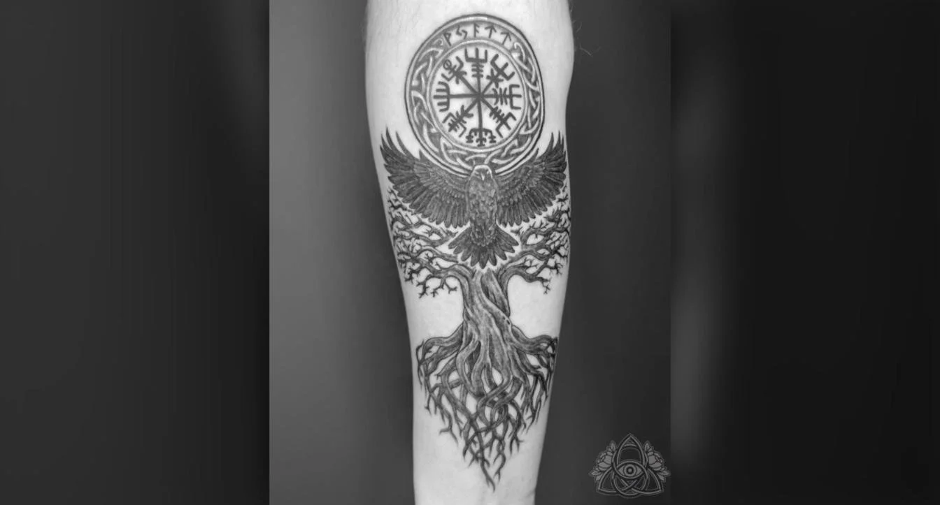
Symbol over likeness: Nordic symbols, a raven, and a tree of life, with the client’s son’s name worked into the design in runes.
Watercolor memorial tattoos: expressive and painterly
Watercolor brings soft color washes, loose edges, and dreamlike compositions to memorial work. It suits flowers, birds, landscapes, and expressive portraits where emotion matters more than photographic accuracy. The feeling it creates is lighter and more atmospheric than the gravity of blackwork, which is exactly right for some people and some relationships.
The practical reality is that watercolor without structural outlines is the least predictable style for longevity. We typically reinforce the composition with subtle linework, and that framework is what preserves the design as lighter pigments fade. Plan realistically for a refresh around the four-to-six year mark, though the exact interval depends on placement, pigment saturation, and aftercare.
How well does each style hold up over the years?
Longevity matters for a memorial piece in a way it doesn't for purely decorative work. Here's how the main styles compare, based on practitioner experience with how each holds up over time. Keep in mind that execution, placement, UV exposure, and artist skill can all shift these outcomes in either direction.
Blackwork (Excellent): Solid black retains visual structure well across all skin tones; dense areas may soften slightly at edges
Black-and-gray realism (Good): Gray washes lighten; large pieces hold facial detail far better than small ones
Neo-traditional (Good): Bold outlines preserve the design as interior colors mellow; light accents require eventual maintenance
Fine line (Moderate): Most vulnerable to fading and line spread, especially on high-friction placements
Watercolor (unoutlined) (Lower): Soft edges can become faint or visually diffuse; plan for touch-ups every 4–6 years (varies by placement and aftercare)
Execution often matters more than the style label itself. A well-executed watercolor piece with strong structural support can outlast a poorly sized fine-line design. Skin tone also plays a real role: on deeper skin tones, high contrast and saturated pigments perform better than pale washes or low-opacity grays. The artist's experience with your specific skin tone matters as much as the style choice does.
Size and placement: giving your memorial piece the space it needs
Realistic portraits need at least 4–5 inches of height for facial detail to stay readable as the tattoo ages. Script lettering needs a minimum of 6–8mm letter height, and fine handwriting reproductions need closer to 1cm. Going smaller than these thresholds is a frequent cause of memorial tattoo regret, because detail blurs over time and a face can become unrecognizable. The person deserves better than that.
Placement follows from your style choice and how visible you want the tribute to be. The chest and over the heart works best for portraits, substantial script, and meaningful compositions. The inner forearm is a strong all-purpose choice for names, dates, and quotes because it's visible to you and readable over time. The wrist is best reserved for short names, initials, or clean symbols, not detailed portraits. Fingers, palms, and feet should be avoided for anything you want to remain sharp; friction and sun exposure accelerate fading significantly in those areas.
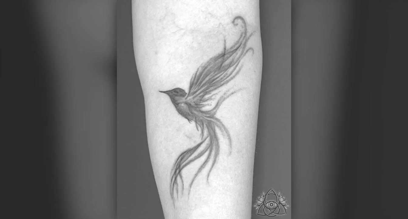
A soft black-and-grey hummingbird on the inner forearm, a placement that stays visible to you and reads well over time.
How to find an artist who takes this work as seriously as you do
Always ask for healed examples first, not just fresh tattoos. Fresh work can look significantly more saturated and crisp than it will once fully settled into the skin. Healed examples reveal whether lines stayed clean, shading settled properly, and color held. Ask for portfolio work in the exact style you want, with subjects similar to yours: portraits, pets, handwriting, meaningful symbols, religious imagery.
Red flags include heavily filtered photos only, no healed work available, and an artist who cannot confirm which pieces they personally completed. An artist who promises a perfect likeness from a low-quality reference is also worth reconsidering. A good consultation looks like this: the artist listens more than they talk, explains trade-offs honestly, asks about the person being honored, and is straightforward about what a difficult reference can and cannot support. They suggest adjustments that improve longevity without dismissing what matters to you.
At Tattoo Garden, our studio is appointment-only and operated entirely by one artist, Michael T. Gardner, who has been doing this work since 2008. The consultation isn't a formality here; it's the beginning of understanding what the tattoo actually needs to become. That unhurried, one-on-one conversation, where you share the story of the person before a single line is drawn, is exactly what emotionally significant work requires. If you're considering a visit from the Greater Vancouver area or the Fraser Valley, we'd encourage you to reach out and explore what a private consultation looks like before committing to anything.
The right style is the one that fits how you carried that relationship
If you're still asking what tattoo style is best for a memorial piece, the honest answer is that the best choice isn't the most technically impressive option or the most popular one you've seen online. It's the one that reflects how you carried that relationship: its weight, its warmth, and what you want to carry forward. Black-and-gray realism for likeness; blackwork and neo-traditional for durability; fine line and watercolor for quiet personal expression. Each has real strengths and real limitations, and the right bereavement tattoo idea is the one that fits your intent.
Most people who regret a memorial tattoo rushed the artist selection rather than the design. Take your time with this. The right artist won't just execute a design, they'll help you figure out what the piece actually needs to say. When you're ready to have that conversation, reach out and let's start there.
Frequently Asked Questions
How soon might I need a touch-up on a memorial tattoo?
You will often need touch-ups over the years, with watercolor pieces typically needing a refresh around the four-to-six year mark. Neo-traditional light accents and other lighter pigments also commonly require eventual maintenance, while blackwork and well-executed black-and-gray realism generally hold longer before needing touch-ups.
Can a very small memorial tattoo still look good over time?
Very small memorial tattoos often lose detail and can become unrecognizable, so we advise against going smaller than recommended. Portraits need at least 4–5 inches of height and script needs minimum letter heights (6–8mm for script, about 1cm for handwriting) to remain readable as they age.
Are there placements I should avoid for a lasting memorial piece?
Yes, you should avoid high-friction or high-exposure spots like fingers, palms, and feet if you want the design to stay sharp. The wrist is best for short names, initials, or clean symbols only, while chest, over-the-heart, and inner forearm are better for portraits, substantial script, and meaningful compositions.
Does my skin tone affect which memorial style will age best?
Yes, skin tone influences how styles age, and higher contrast and saturated pigments perform better on deeper skin tones. Execution and the artist's experience with your specific skin tone matter as much as the style label in determining long-term readability.